Old House gets New Kitchen
SCOPE: renovate an outdated and cramped kitchen for a family of four
A beautiful American Foursquare in Rogers Park was irresistible when a young family was looking to move many years ago. Despite its age and need of work, it was livable, so they forged ahead. As their children were growing up it began to feel cramped. The layout wasn’t functional and the cabinets were dark and dated. The goal was to update the kitchen while keeping in style with the architecture of the vintage house.
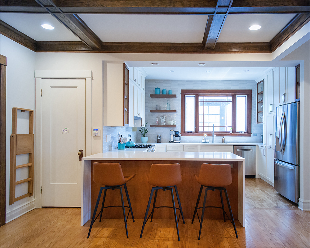
Pushing the peninsula into the adjacent dining room gave more room to the working area, while serving to connect the kitchen to the open dining room. Storage was increased with a tall pantry cabinet and lazy-susan cabinets in all 3 corners.
Classic warm-white cabinetry lightens up the space and provides a contrast to the dark trim and floors. Wood shelves are placed among the white cabinets to provide space for books and display while pulling in the darker wood tone featured in the house. Crayon shaped subway tile in gray tones adds a modern touch of texture and interest.
From the kitchen a bar area by the back patio door can be seen. This ‘home bar” was a design project we completed for the couple when they first moved. It provides storage and an entertaining area in a previously empty space. With bar seating and an open floor plan this old house functions in a modern way.


